Networking T Shirt & Business Card Branding
Version 3 - Networking T Shirt
T Shirt - Concept and Prototype
This was an idea and problem solve I came up with for networking events where lots of time was wasted trying to find who best to speak to with a relevant background.
I was looking for Props, Art Department and Set Decoration People and more importantly those with an interest in recruiting them.
The problem was with everyone dressed smart casual, I didn’t know who to talk to and neither did anyone else. There was nothing to indicate their area of interest and skill set, to attract the right people and for me to find them.
After coming across actor after actor, writers, budget movie wannabe directors and other into music I got fed up wasting time, especially as at their events there was little time increasing the chance of missing the correct people by the time the event was closing.
So I thought screw this and asked for some paper, a sharpie pen and some Sellotape and wrote Art department and Props Trainee and stuck one sign on my front and one on my back.
This elicited a lot of amusement, but more so what they found funny was that it was such a good idea as everyone else was in the same boat, saying they would try that next time and they wish they had thought of it, thus wearing a big sign that says I’m looking for Art department, Props and Set Decoration and this is me, my details and some portfolio examples seemed a good idea.
This was a cheap, tacky proving principle proptotype, but did the job and worked, so I thought I would turn this prototype into an actual designed t shirt with some work examples & print it.
Something to showcase my talents with contact into and some branding.
So far, the t shirts have gone down great with all thinking they are a great idea and developed the idea into better versions.
This is my latest August 2025 version.


Version 1 - Networking T Shirt
Not technically version 1, that was the prototype of a hand written sign on sellotaped paper, this was the version 1 T-shirt.
Thinking about what should appear I thought it should include:
- My Brand Logo to look professional
- To state I was a Designer
- Include some of my creative work examples forming a mini portfolio to show what I could do
- That at the time I was a prop and art department student at Pinewood Studios Creative Media Skills training centre.
A course that covered:
- Art Department
- Set Decoration
- Prop Making
- Set Building
- And to include my email and portfolio website link people could photograph and go to.
Name dropping what course helped give credibility being at Pinewood Studios and the tutors being known big movie art directors.
The norm from what I had seen with T shirt design was a smaller image on the front and bigger one on the back. More importantly bigger meant more examples of my work and bigger thus clearly images
As this was a rush job for an up-coming event that day or day before I forgot to add set decoration.
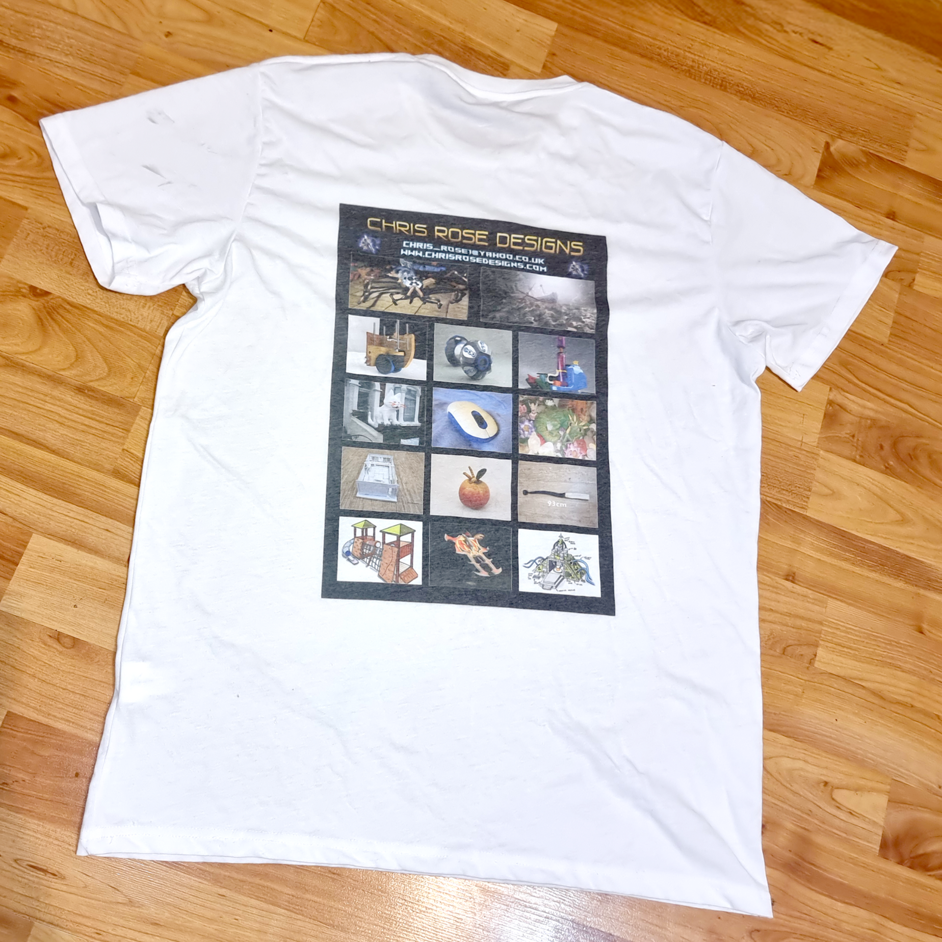
I also had to try and print the t shirt locally as was in a hurry and there was just a local Snappy Snaps photo lab with just white t shirts.
The print was a poor-quality heat transfer, in fact it took over an hour due to technical problems with the equipment so in the end it had to do so I could get to the networking session.

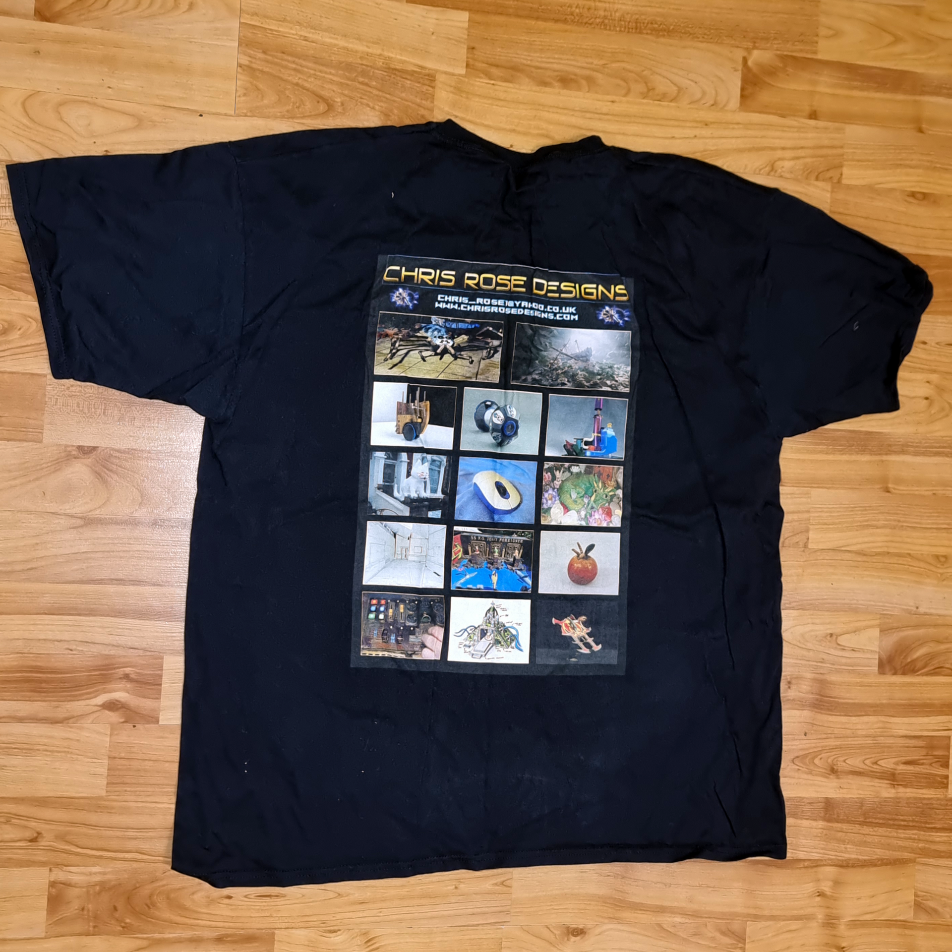
Version 2 - Networking T Shirt
Version 1 was still not good enough as had been rushed. The next version I had more time to play with so:
- Tidied the design up.
- Added more up to date photos from my course.
- Paid considerably more to print on a black t shirt to be more blended.
- This was direct printed which was necessary for printing onto black as heat transfers were transparent. This was ontop of a white base for a clearer image
- This looked much better and have been using this for a year.
- However there are still some flaws to fix and improvements needing doing.


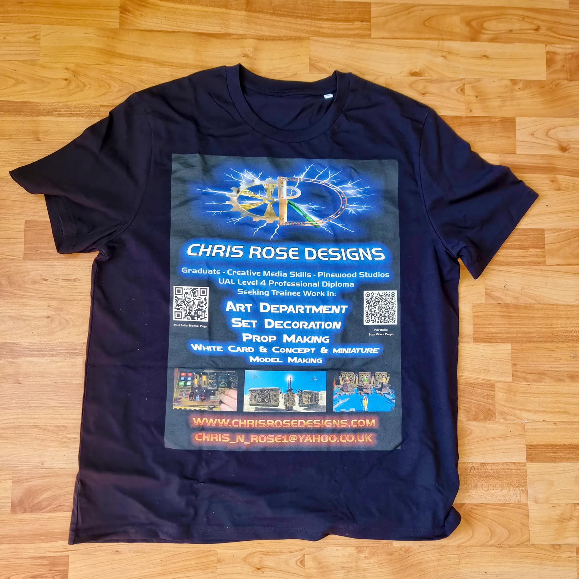
Version 3 - Networking T Shirt
Problems to Fix and Ideas to Incorporate
Problems and Issues still in the version 2 t-shirt were found to be:
Bigger is Better
The front image was too small at A4 size and hard to see on a t shirt, more so in a darkened bar with as the typical venue.
So, I researched where I could get A3 plus images back and front, Vistaprint offered 34 cm x 43.7 size, bigger than A 3 so went with that.
The text is also much bigger, brighter and more dynamic to me easier to read and more blatant. Clearly communicating what I’m about.
It was also where I was getting my business cards done so figured that:
- A more professional established company so likely to give better quality and equipment.
- Much bigger choice of T shirts, shape, quality durability and print areas.
- Discounts with the card order.
Going High Tech with QR Codes
- QR codes were thought to be a good idea so I could be scanned sending people straight to my portfolio website with or without a practical portfolio.
- Given that it’s the front people see first and when talking to me and when I was walking around and I wanted to add some taster photos of my work, my best stuff.
- The QR codes include one for the website home page and one for my best work, my Star Wars project props. This can be seen in the left and middle images on the front.
- The QR code idea also makes it a fun game for a group to scan me and save my portfolio page straight to their phone, in a manner then can easily forward it to others.
Becomming the Event Game. Straight to my Portfolio.
The whole novelty increases the numbers photographing me and my details, making it much more memorable than a business card hand over. I’m also the more talked about one, the dude in the networking t shirt.
Lighting up in the Room
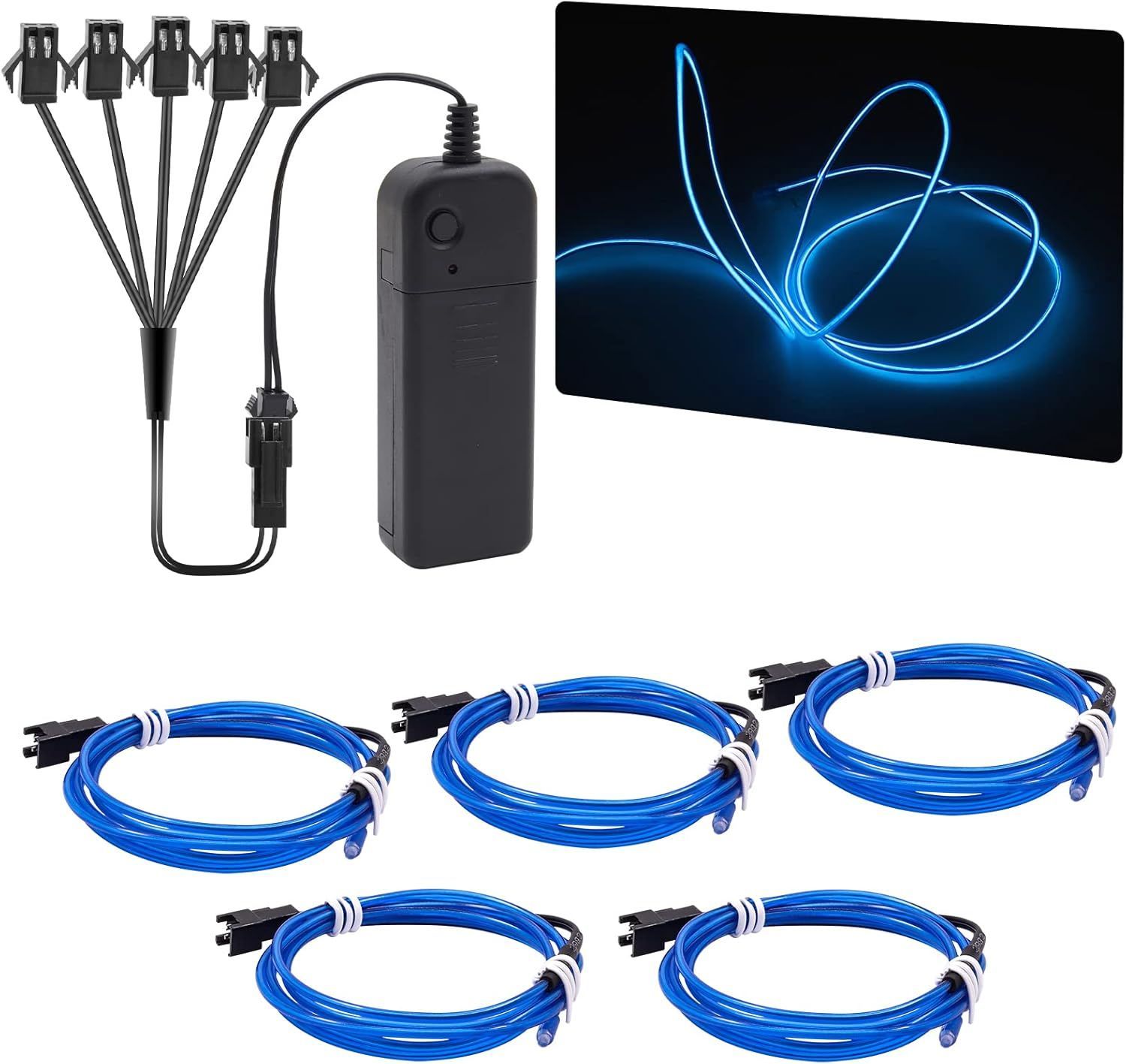
- More so I have been looking into how to feed though or otherwise attack electroluminescent wire, tape or other material to enable me to actually light up the t shirt, possibly with flashing light patterns. I will need a way to be able to remove this for washing.
I am looking into ringlets so the adding and removing of the electroluminescent. - I also made me stand out thus if anyone spoke to someone relevant to me, I’m incredibly easy to point out so they know who to look for and walk straight over to me.
Upgrade Summary
- Much brighter, bigger and clearer text and imagery filling the t-shirt.
- Optional light up elements so I glow in the dark further standing out.
- QR codes to add a game element that’s fun and sends people straight to my portfolio and best work.
- Much more memorable and getting more attention.
- Better work photos and bigger clearly ones.
- More up to date and better photos to showcase best work.
- Better T Shirt material as well which should make it longer lasting and more durable.

Lighting it Up Tron Style Strategy
Having designed a T-Shirt with a black back and test appearing to glow in an energetic manner with the purpose of drawing attention to art department skills I decided I wanted to take this further and taking inspiration from light up in the dark Electroluminescent T-shirts seen in cyberpunk shops like Cyberdog in Camden and films like Tron. Concept art can be seen with these two photo montages examples whihc would involve light up arm patches and electroliminescnt string piping down the sides and underlining the design.
This would certainly attract attention and curiousity in a darked bar. More so if the light up patches were flashing, ideally to the beat of any music This would demonstrate some technical art skills usful in prop making, as well as make myself incredibly very easy to be identify and find, when someone I had spoken to finds someone else looking for props and art department people and they can point out, oh you are looking for Chris , he is the one in the light up T -Shirt spotable accross the venue. Also adds some interactive fun, coolness and an indicator or creative, problem solving thinking with the QR code scanable t-shirt.


Technical Issues to Problem Solve
THaving designed a T-Shirt with a black back and test appearing to glow in an energetic manner with the purpose of drawing attention to art department skills I decided I wanted to take this further and taking inspiration from light up in the dark Electroluminescent T-shirts seen in cyberpunk shops like Cyberdog in Camden and films like Tron.
This would certainly attract attention and curiosity in a darked bar, more so it the light up patches were flashing, ideally to the beat of any music, demonstrate some technical art skills as well as make it very easy to be identified when someone I had spoken to finds someone else looking for props and art department people and they can point out, oh you are looking for Chris , he is the one who’s t-shirt is lighting up and flashing, instantly spottable from across the venue. Also adds some fun, coolness and an indicator or creative, problem solving thinking.
Issues and Problems to Solve
Having the idea and how to go about it were more complex.
Light up material patches, string and more so the battery electronics and wiring are:
- 1) Fragile
- 2) Not water proof
- 3) Not smashing and spinning in cleaner chemical water churching around for an hour.
The wiring and electronic battery pack had to be:
- Supported not dangling and held in place.
- To be comfortable and save not cutting into me.
- Be able to handle body movement
- To have the wire run though the material from the battery pack to light up material without damaging it.
So, I needed to think of a method where the electronics, wiring and patches could be regularly removed for washing, comfort and safely, durable and flexible and secure.
Prototyping
I decided to use my first t shirt, the white one as an experimental test bed as was expendable.
Various method of loops and hooks to run the electroluminescent glow wire looked into and different elastic loop sewing techniques tried that would work without disfiguring the t shirt which was valuable.
These include cutting holes with various methods to sew leather or clear silicon rubber.
None of which worked.
I found cutting about 3 sewign looks on the seams and sewing to the inside seams was much safer and neater but the seam overlocked threat started to fall apart and unravel as soon as cut so had to tie this up straight away.
The glow wire looked tacky however it was done and bending all over the place looking a cheap tacky mess as well as likely to get caught on something or someone so this was abandoned.
Ringlets that hammer together with a special hammer too enabled stable pass through holes for the wiring and connection plugs that did not tear the t-shirt further.
2 types of Velcro were uses. Stick on glued male Velcro teeth ribbon on to attach to the patches, and non-glue sew loop bush female Velcro on to the t shirt arms.
I worked out the 60 degree patter using a 360-degree protractor and blue electrical tape for marker.
Hand stitching was used to pin the Velcro in place on the t-shirt, then this was reinforced to properly attach with a sewing machine.


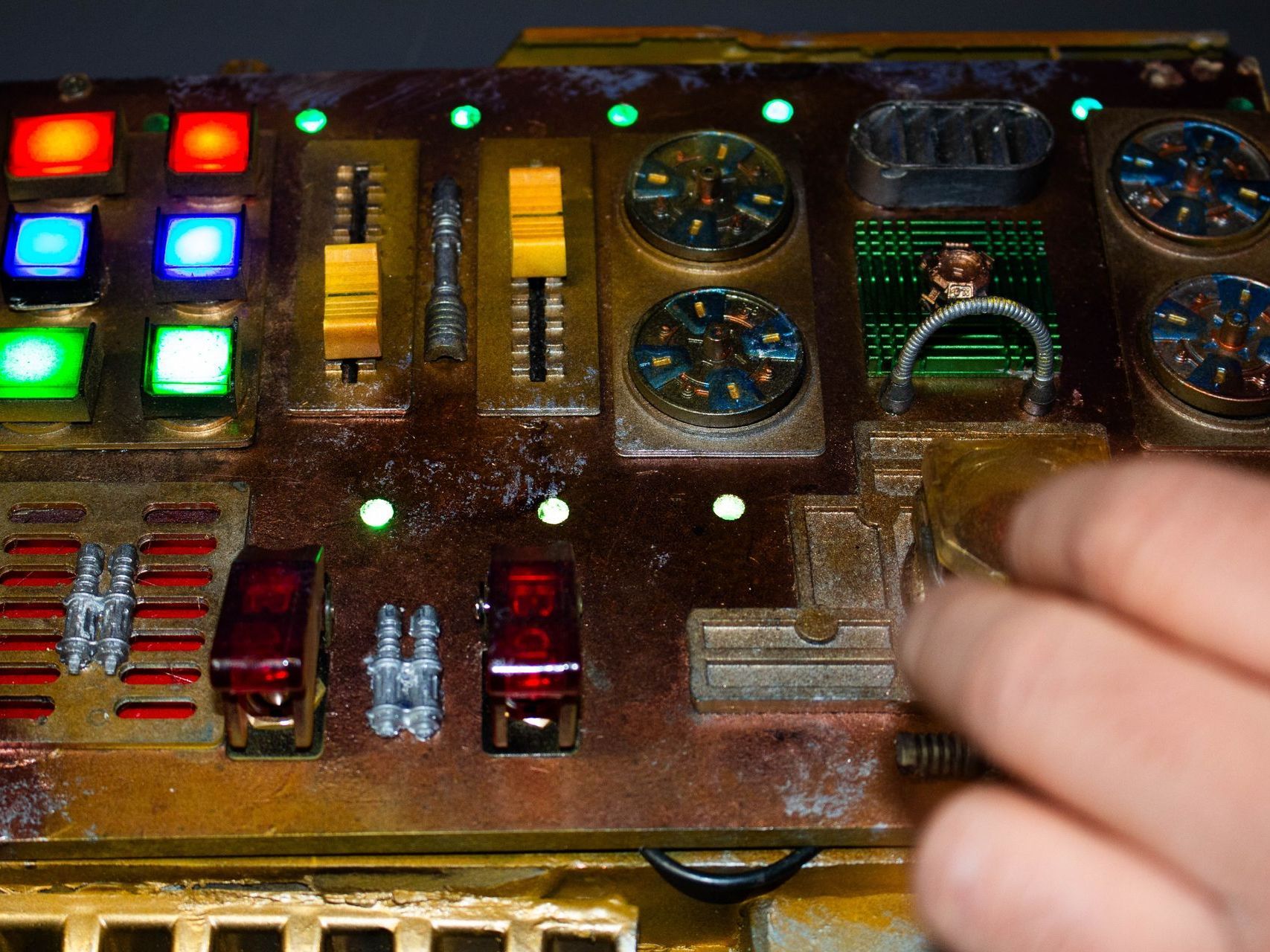
Adding Plasma Disks
I wanted to add plasma disc to the centre of the rings as they did not light up enough and it would give a more - high tech look and be fun to play with and attract more attention.
Problems to Solve
I made the arm pads from black Plastazote or EVA foam used on Larp weapons.
2 layers and then carved them into an egg shape with bevel to fit the arm with a hole for the plasma disc battery box.
The added a bevel so it fitted the curve of the t shirt and added a curved indent on the inside to more ergonomically fit my upper arm.
Problem 1- How to Attach
The main problem with these discs was they were not flat like the electroluminescent discs.
The were a few cm thick and heavy.
This mean it would not work to try and Velco them on to the outside of the t shirt as likely to fall off and beak and top with gravity and flop over.
Solution
The solution I came up with was to place then under the t shirt arms with the dis emerging in a hole cut though the t shirt arms.
To embed them in foam arm pads which would hold them in place, indented and velcro these under t-shirt arm pad to the underside of the t-shirt arms.
I would also need access to the switches.
his would enable me to both be able to hold the plasma discs securely, comfortably, and be able to pop them out to access controls and replace batteries as well as remove them for washing. Easier said than done.
Problem 2 – Maintaining Hole integrity
The next problem I found was that when I cut the holes in the t shirt arms the holes kept expanding on the first arm and fraying.
Solution
I lined the hole area on the arm and surrounding area , with Kite grade rip stop nylon which nether stretches nor frays. The second arms was much neater as did this before cutting the hole.
Problem 3 – The Arm Pads Ergonomics
Arms taper down, are curved not square to needed to shape the pads/
Solution
I made the arm pads from black Plastazote or EVA foam used on Larp weapons.
2 layers and then carved them into an egg shape with bevel to fit the arm with a hole for the plasma disc battery box.
The added a bevel so it fitted the curve of the t shirt and added a curved indent on the inside to more ergonomically fit my upper arm.
Problem 4 – Attaching the Pad to Inner Arm
The idea was all this could be removed for washing. Thus not all sweating for hygiene.
Attaching glue on Velco was not practical as the glue dopes not hold well to the foam.
Trying to sew through the foam given it was 2cm thick did no seem easy or practical.
Solution 4
So I made stretchy covers for the pads out of old trainer sock . Just the right size and velcroed them.
This was not easy due to the stretchy material and as this kind of sewing on materials would normally be done before socks were sewed into a 1 side sealed cylinder.
I also added an indent on the inside of the foam to be able to access the switches with fingers to switch on and off and to music reaction or stay on


Business Cards
- I wanted my business cards to stand out so have UV Plastic coats to give a shiny 3d feel and appearance looking more professional and stand out as well as colourful.
- Keep my branding identify with my logo featuring:
- Dynamic special effects.
- Crafts.
- Engineering and lighting.
- As these cards are for networking it very much helps to give people a reminder of who gave them the card with my photo.
- Again, emphasising the Pinewood Studios Training at Creative Media Skills.
- QR codes leading to my portfolio start page on the front and CV and mini portfolio download on the back.
- A good example of my best work on the back to show what I can do.
- Curved cards which not only look more professional and up market, by fit into wallets easier and avoid damaged corners.