Elements to Incorporate
To create a brand identity & logo for this website & myself was hard as I’m many things.
I am a blend of engineering, creativity, a variety of craft, product, presentation, prop and model making skills, electronics & innovation. Looking to make the world a better place, thinking outside the box, to apply experience and observations, looking to wow with great effects, exciting shows or would be podcasts/radio shows, wild party games, horror effects and more.
One simple abstract symbol logo would be difficult to represent all that.
The starting point was to mind map these elements visually then to try & combine various elements into a hybrid form.
Sketching began around letters with creative elements.

Sketch Development

CAD Development
I made the decision to develop a CAD based logo for a number or reasons:
- It would show a variety of design development skills and creativity.
- There would be an opportunity to make a 3D Logo model which later would be nice in an office.
- It could show a variety of parts in different materials and show different elements of my creativity.
- It looks more exciting.
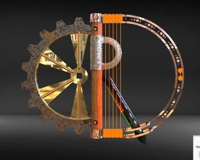
The parts were to be forms of the letters (C), (R) and (D) as in Chris Rose Designs.
Elements to include:
- (C) A cog to represent mechanics.
- (R) A battle axe to represent the prop weapons, wood and metal with an acrylic plastics diagonal element.
- (D) Copper circuitry to represent mental fabrication and electronics and embedded system.
(C) Cog
Went for the idea of a 2 element cog to highlight the arc of the C. This needed tabs with bolt holds to connect with a flat edge.


(R) Axe Shaft
This needed a flat edge with slots and bold holes for connection and mating as well as a connection slot for the diagonal element.
Below is the development of the parts.
Below is the development of the parts.


(R) Axe Head
The metal part of the (R). This needed sweep cuts for the blade and flat platforms for bolts


(D) Section Metal Fabrication and Electronics
The D section covered the electronics elements of my creative background and metal fabrication.


Solder pads were added with twin rails to form circuits.
A loop was incorporated for the diagonal section of the R.
(R) Diagonal
I moved away from the original concept of a dagger as there was already a weapon element, so went for a crystal acrylic element with a connecting tab to enable mating at an angle with the shaft.


LED
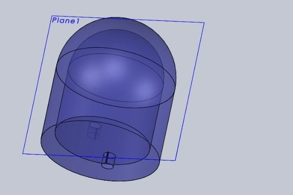
The first of 2 sub-assemblies. The white element replaced the lighting element so it could be actually designated a light source inside the bulb when rendered. A dome end was added then shelled out and holed and mated together.


Resistor
A simple component that could be attached to the (D) pads. Designed so different ring combinations could be added. Slots and tabs were added to the leads to prevent rotation and lock assembly mates.


Assembly
Components assembled together with a variety of coloured LEDS and some bolts.


Rendering
Here materials were assigned to the components of the model including wood shafts, gold or bras for the (C) spokes, steel and iron on the axe head, brass bolts, gem and glass for the coloured LEDs.
Point lights for the anode ad cathode inside the LED bulbs, copper for the D.
Whilst at first the diagonal section was to be emerald with a dark background this could not be seen so swapped this for green anodised aluminium with stone and painted rings on the resistor.
A dining room reflection map was added then a black background under studio 3 point lighting was incorporated.
It was during this process I noticed the need for a pair of LEDS at the centre of the D curve and that after rendering a darker wood looked better after the first render.
It was during this process I noticed the need for a pair of LEDS at the centre of the D curve and that after rendering a darker wood looked better after the first render.
This was then left to render over night.


Post Rendering Photoshop Enhancement
After rendering the logo had to be prepared for use and insertion into the website, letter heads, business cards etc.
Separated from the rendered background, the log was first placed on a black background, then an electrify effect was added. However the wood seemed too light so was re-rendered as mentioned with darker wood.


Final Choice for New Brand and Website Logo
I liked the lightning effects on the on the logo making it more dynamic, with bevelled and metallic text. Whilst I did like the various electrified text effects, removing them made the text much clearer to see and left the effects for the logo itself with this final choice and stage.


